| Entrance | Mainstreet | Wiki | Register |
|
# of watchers: 11
| D20: 19 |
| Wiki-page rating |  Stumble! Stumble! |
| Informative: | 0 |
| Artistic: | 0 |
| Funny-rating: | 0 |
| Friendly: | 0 |


2011-11-11 [Eyonic]: yay for random things! new
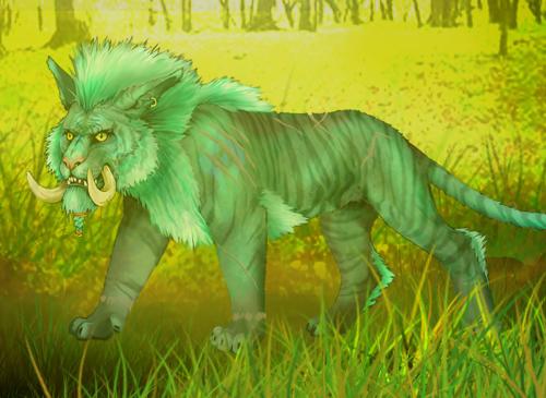
2011-11-11 [Chel.]: I like the contrast and silhouette look. However, I think this would benefit from crisper, sharp lines on the outline of the cat. It's a bit too fuzzy and looks out of focus. I will suggest using a photoshop brush that is crisper.
2011-11-12 [pegasus1000]: I agree with [Chel.] on this one. It is a nice piece but could be crisper. I'm not sure if I like the tail, but it is nice.
2011-11-14 [Ravendust]: cute, a bit fuzzy, but cute :)
2011-11-14 [Eyonic]: yeah, he is very fuzzy hehe. was having problems getting my brushes to be crisper. ever since my kid pushed a few buttons while i was looking away my brushes have been a pain in da butt, having to go over the same line a couple times to get it solid.
2011-11-28 [Eyonic]: new thingy
2011-11-29 [Ravendust]: Nice, I like :)
2011-11-30 [pegasus1000]: Love the shading. Good job
2011-12-20 [Eyonic]: yay holidays!
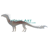
2011-12-20 [Ravendust]: nice, I was working on a dragon myself... xP
2011-12-20 [Eyonic]: i had a different one drawn, but i don't have a scanner so i decided to use something i already scanned in a while ago
2011-12-20 [pegasus1000]: It's really cute. I hope you get a scanner soon.
2011-12-21 [Aeolynn]: I like the dragon's pose and coloring, and the face is cute. However I feel like the dragon is in 3 pieces, background legs, wings, and the body. The scales should extend to the other legs and the wings imo and it splits up the image.
2011-12-21 [Eyonic]: hehe yeah, I got lazy after doing all the scales on the body XD. couldn't figure out how to get the wings to mesh in better
2011-12-21 [The Dizzy Raven]: It's so cute!!! I love the hat :)
Though, in all else, I enjoy the textures you used for the scales. :) And I agree with [Aeolynn] :3
Agreed about the laziness I have my lazy days once in a while. XD Curse you laziness!! *shakes fist*
2011-12-21 [pegasus1000]: I am just wondering how this dragon will look in flight. The wings are a bit low (below the shoulder)and extend to the tail. It would be really cool to see this dragon fly.
2011-12-21 [Eyonic]:
@ [The Dizzy Raven] it took forever to get those scales done! hence the laziness.
@[pegasus1000] Maybe thats something I will have to draw.... though i would make the tail longer for the 'reference sheet' so that it could fly >.>
2011-12-22 [Aeolynn]: Also the white BG distracts from the hat and makes it blend in. I'd suggest a gray bg next time with a slight darker gray gradient
2011-12-22 [Eyonic]: yeah, I tried putting a gray one on, but then I accidentally froze it, so white it was :P but the gray background does look much better
2013-02-02 [pegasus1000]: This is a good start. :)
2013-02-02 [Eyonic]: thanks pegasus :D I updated it now
| Show these comments on your site |
|
Elftown - Wiki, forums, community and friendship.
|